Marilyn Henrion


These photos are from which Marilyn Henrion's 'Patchwork city' series, which I think best captures the concept of fragmentation, and even "captures the energy and vitality of cities everywhere". I think that the most effective element of these photos are the elements of colour, as these colours are present throughout every city in the world, and by using this effect of colouring, there is more life and activity within the photo. The first two photos effectively demonstrate this concept by contrasting warm and cold colours to create the effect of day and night. The geometric patterns within these collages also mimic the harsh and brutal nature of urban scenery, down to the angular shapes found within every building. I could create a response to her work by isolating different elements of a city landscape, and layering them over each other to create the fragmented and 3D effect. I would then edit the photo either on photoshop or physically to mirror the day/night effect, but I may take more inspiration from the second photo and create shapes within the photo instead of using a separation like in the first photo. I could also take the main fundamental colours from each layer and taint the whole layer with that colour. I think that this would make an effective response to her work, as it would bring the cityscape to life by making the photo alive and ever-changing.
First responses


Above are my first responses to Marilyn Henrion's work, which I think are effective, as they mimic the chaotic and harsh nature of her photos. In particular, the first photo immediately brings the life that can be found within cities, that Henrion also attempts to capture. I think that this is successful, as this creates a connection between the photo and the viewer, in a way that the original photo would not. I made his photo by editing the original photo into the different colours that will be in the final product, and printing them. I then cut out the different elements of the photos where I wanted them to be, and them layered them over one another. I then stuck a thick piece of paper in between each layer to create a shadow effect. In the second photo, I have tried to take more inspiration from Henrion's work, as well as correcting some of the flaws in my previous piece. For example, in my first photo, I think that the edges where I cut the layers apart are slightly rough, and I have improved this in the second photo. Also, I think that the photo I chose could have been more accurate to Marylin Henrion's work in the first photo, and I have again tried to correct this in the second photo, so that I can capture the layers of the city more accurately. Finally, in the first photo, In think that a small problem could be that the layers that I have selected seem more random, which could be more successful as a photo, but I think that as a starting point, the second photo works better. In the third photo, I have tried to mirror the effect of Henrion's work, where she incorporates shapes to break the geometric pattern of the rest of the photo. I think that this photo is effective, as it also brings in an element of spontaneity into the photo, capturing the essence of an urban photo. To improve this, I could ensure smoother transitions into the shapes by using photoshop, as a circle is difficult to cut out perfectly.
Second responses


Above are my second responses to Marilyn Henrion's work, which I think are much more effective than the first responses, as they relate more directly to her work. I also think that the setting of a beach is somewhat more effective than that of a city. This is because there are no major components and subjects within the original photo, meaning that the fragmentation of the components within the photo are exaggerated. Furthermore, many of the components in the photo are horizontal, making them perpendicular to the bars, again exaggerating this fragmentation. I think that third photo is the most successful, as it brings in the element of colour that is present in Henrion's photos. The use of the contrast between these warm and cold colours brings in another element of fragmentation, as there is a larger isolation within the photo. Furthermore, the urban setting is more effective, as there is a slight geometric harshness to the photo, which could mirror the brutality of urban settings, and is present in Henrion's work. I also made the decision to keep the bars at the top and bottom of the photo, as they create an unsettling feeling, and quite literally fragment the standard border for a photo.
David Seidner


I think that David Seidner's work effectively displays the concept of fragmentation, as a combination of physical and digital effects are used to create a fragmented collage. For example, I think that the first and second photos have been created using effects taking place afer the photo has been taken, but the photo on the far right has not been edited, and could be viewed in the same way in real time. I think that this concept of taking photos is effective, as it brings in the use of practical effects. Many different angles of this photo can be viewed, which is effective at incorporating the concept of fragmentation, as all elements of the photo can be seen in different places throughout the photo. This creates a detached feel to the photo, as all components of the subject are split apart, making the photo feel meaningless and emotionless. I may try to take inspiration from this concept, and I could do this in many different ways, for example by using a kaleidoscope effect in my photo, I could split up the subject of the photo to make it spread throughout the photo. I could also make a response to the first and second photos by ripping up a photo and re-ordering the components to incorporate this 'multiplying' effect.
Response


Above are my first responses to David Seidner's work, which I think are effective, as they effectively mimic the detached and chaotic feel of his photos. For example, I think that the first photo is an effective example of this, as the subject is split apart, making the photo feel devoid of emotion and meaning. I think that the second photo is more effective, as the lack of colour creates a murky and empty feeling to the photo, bearing more similarities with Seidner's work. I could also achieve this effect by using a kaleidoscope over the lens, or by also using refraction to alter the position of the subject within the photo. The second and third photos also effectively demonstrate the concept of fragmentation, in a more subtle way than the first two photos, as I have ripped the photo up in both, but instead of completely re-ordering the photo, as has been done in the first picture, I have just re-aligned different components of it. This is effective, as there is an uneasy effect to these photos
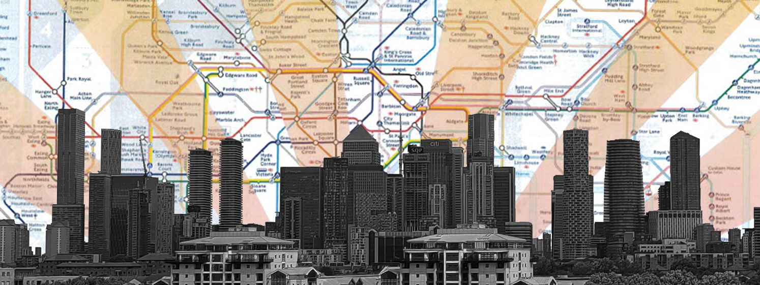
Jayson Lilley


I think that Jayson Lilley's work effectively captures the concept of fragmentation, as themes of minimalism and isolation are explored across urban landscapes. For example, in the first photo above, a sense of fundamentalism is established, mainly through the background, as both the foreground and background literally contain 'the city of London', but in different senses, creating a fragmentation in meaning. Furthermore, the use of the contrast in colour between all elements of this photo, for example the bursts of green, yellow and red with the black and white cityscape, and finally, the beams of colour within the tube map create a vivid contrast between each layer of the photo. Also, in these photos, the urban element is always black and white, with a generally low exposure, which isolates the cityscape against the background, creating a clear focus on the urban setting. In addition, the use of leading lines in the background adds to this focus, as the eye naturally focuses onto the city. This repeated effect creates a unique form of fragmentation, as a sense of vitality and focus is expressed rather than detachment, or a lack of emotion.
Response
I think that this is a very effective response to Jayson Lilley's work, as it effectively mimics the minimalist feel of his work. For example, the style of both the foreground and background are very similar to Lilley's work. However, there are a few differences. For example, the exposure of the urban setting is much lower, exaggerating the contrast and split between the background and foreground. Furthermore, I have incorporated a gradient within the beams in the background, gradually getting warmer towards the cityscape. I think this decision was effective, as there is a larger colour palette in the background, further emphasizing the contrast within the photo. To improve this photo, I could incorporate some of the spontaneous splashes of colour within the foreground that are in Lilley's work, to include a larger variety within the foreground, as I think that at the moment, the foreground somewhat lacks the vitality present in Lilley's work.
Fragmentation mind map

Photos linked to fragmentation


These are some photos that I will use as material for future responses. I think that these will make effective material, as they are photos that can easily be manipulated to bring in the concept of fragmentation. I think that this is because many of the photos have a lot of open space within them, so there is a lot of potential to be altered in response to an artist.
